James Thinks
writing is a kind of thinking
Mark Rigby's Rough Diamond is described as a "fast 300" on good roads and, being in July, the weather is usually better than 300s in the Spring. Ideal for those attempting this distance for the first time, like my wife Erica, so we did the ride together on the tandem. It's a great ride and I'd recommend it to anyone doing this distance for the first time.
Many cyclists, myself included, track their rides on GPS analysis sites such as Strava. After the ride you can pore over the statistics to find out how your speed varied and, with additional sensors, where your power output dipped, your heart rate shot up or your cadence was sub-optimal. Besides a thorough approach to training, I think there's a lot to be said for using these sites for nostalgic reliving or sharing rides, adding photos or planning future routes. It can be motivational too. Trying to beat my personal records on Strava was what got me back into cycling properly some five years ago. But, liking gadgets as I do, I know I'm at risk of being sucked into obsessing over performance data. Erica teases me about uploading my rides before I've even had a shower. So whenever I'm on an audax I defiantly tell myself I'm "out for a good time, not a fast time", taking in the scenery, chatting to people I meet on the way and enjoying the adventure.
Those at the very front or back of the field may have more reason to scrutinise their average speeds. Indeed, it's prudent even for those of us normally in the bulgy bit of the bell curve to keep one eye on the clock as I know from my failure to complete PBP last year. But, for many audaxers, the additional data is not of much interest and might even be considered a distraction from the enjoyment of the ride.
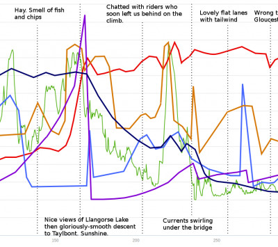
I enjoy looking at visual data, like that presented in the book Information Is Beautiful. So I produced a graph tracking what I thought was interesting on the ride. The result may not be exactly beautiful, but I thought it was interesting. Everyone will have their own opinions about what makes a great ride; the variables I've described with the graph are the ones which Erica and I thought were important. They're also not very precise because we tried to reconstruct them later. I guess we could've carefully noted each one every fifteen minutes to get accurate results, but we didn't want any distractions from navigation, chatting and looking at the view. Besides, that would probably be more annoying than constantly checking our cadence. Maybe one day someone will make sensors to measure some of this directly!
Thin green: Elevation profile. The only variable I've taken from the GPS track. It helps to work out where we are on the route and you can see how the climbs and descents affected the other lines. It includes the short ride to and from our accommodation.
Light blue: Social interaction. You're never alone on a tandem, but we still enjoyed chatting with other riders, or just cruising along with them on the flatter sections.
Dark blue: Clothing dampness. This was affected not only by the morning's rain but by riding up hill a bit too quickly without shedding layers.
Purple: Hunger. A rough average between myself and Erica as we seemed to get hungry at about the same time on this ride.
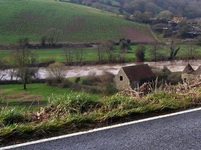
Brown: Scenery. Plenty of interest along the route, but some definite highlights including lakes, rivers and architecture.
Red: Morale/confidence. Again an average between the two of us. This was greatly affected by everything else we tracked and some particular events which I've marked on the graph.


James Bradbury
I write about whatever is on my mind. I do so mostly to help me think more clearly. If other people find it interesting that's good too. :-)